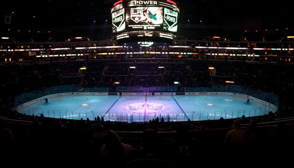
The Los Angeles Kings have unveiled a new logo that harkens back to the iconic 1990s Gretzky era, aiming to bridge past glories with present-day ambitions. The updated emblem revives the beloved "Chevron" design from the Wayne Gretzky years, providing a nostalgic nod to a golden age in the franchise while setting the stage for future victories.
A Blend of History and Modernity
Wayne Gretzky's influence on the Kings' branding is unmistakable. During his tenure, the team’s identity evolved dramatically, and the new logo seeks to honor that transformative period. The "Chevron" design, a staple of the early 90s jerseys, has been reimagined for a modern audience. Notably, the new logo features "Los Angeles" prominently at the top, reflecting both a sense of civic pride and historical continuity.
Moreover, the updated version of the original 1967 crown is woven into the design, encapsulating the franchise's rich history and its ongoing evolution. This blend of classic and contemporary elements is crafted to resonate with both longtime fans and new supporters, capturing the essence of the team's journey over the decades.
A Carefully Crafted Redesign
The new logo replaces the previous one which was introduced in 2008, marking a significant shift in the Kings' visual identity. The redesign project was a meticulous process, taking two years of dedicated effort and collaboration. Luc Robitaille, a celebrated figure in the organization, emphasized the extensive teamwork involved in creating the new emblem. Feedback was solicited from both past and current players, ensuring the logo encapsulates the team's collective spirit and heritage.
Robitaille shared, "This has been an extensive and collaborative process, and we are thrilled to roll this out to our fans and the city of Los Angeles. This evolution is rooted in our 57-year history and embraces the elements of our eras. It also involved interface and feedback with players both past and present, and it sets the stage for extensions and new iterations in the future."
A New Era for LA Kings Hockey
Kelly Cheeseman, another key figure in the organization, expressed the pride felt throughout the franchise as they usher in this new era of LA Kings Hockey. "From ownership to our players, our organization is proud to usher in a new era of LA Kings Hockey. We are excited for our fans to be part of this with us," he remarked.
The new logo will make its debut for purchase on Friday, June 21, at the Team LA Store located inside the Crypto.com Arena. This launch event will be a significant moment for fans, as they get the first opportunity to own merchandise featuring the revamped emblem. The fusion of classic and modern design is expected to strike a chord with the Kings' diverse fan base, uniting them through a shared appreciation of the team's storied past and promising future.
Honoring the Past, Embracing the Future
The revived logo represents more than just a visual change; it is a symbol of the Los Angeles Kings' ongoing journey. By incorporating elements from different eras, the design serves as a bridge connecting historic moments with future ambitions. This thoughtful approach ensures that the new emblem resonates deeply with audiences, serving as a constant reminder of the team’s heritage while looking ahead to new possibilities.
The Kings' dedication to honoring their past while embracing the future is a testament to their evolving identity. As the franchise continues to grow and adapt, this new logo stands as a beacon of continuity and innovation, reflecting the enduring spirit of the Los Angeles Kings.